この記事では、StatelessWidgetでFlutterでボタンを表示する方法について書いていきます。
サンプル
import 'package:flutter/material.dart';

void main() {
  runApp(const MyApp());
}

class MyApp extends StatelessWidget {
  const MyApp({super.key});

  @override
  Widget build(BuildContext context) {
    return MaterialApp(
      debugShowCheckedModeBanner: false,
      title: 'Stateless Button Demo',
      theme: ThemeData(
        colorScheme: ColorScheme.fromSeed(seedColor: Colors.deepPurple),
        useMaterial3: true,
      ),
      home: const ButtonDemoPage(),
    );
  }
}

class ButtonDemoPage extends StatelessWidget {
  const ButtonDemoPage({super.key});

  void _showSnackBar(BuildContext context, String buttonName) {
    ScaffoldMessenger.of(context).hideCurrentSnackBar();
    ScaffoldMessenger.of(context).showSnackBar(
      SnackBar(
        content: Text('$buttonName がタップされました!'),
        duration: const Duration(seconds: 1),
      ),
    );
  }

  @override
  Widget build(BuildContext context) {
    return Scaffold(
      appBar: AppBar(
        title: const Text('StatelessWidget ボタン一覧'),
        backgroundColor: Theme.of(context).colorScheme.inversePrimary,
      ),
      body: Center(
        child: SingleChildScrollView(
          padding: const EdgeInsets.all(16.0),
          child: Column(
            mainAxisAlignment: MainAxisAlignment.center,
            children: [
              // 1. ElevatedButton(主要アクション)
              ElevatedButton(
                onPressed: () => _showSnackBar(context, 'ElevatedButton'),
                child: const Text('ElevatedButton'),
              ),
              const SizedBox(height: 12),

              // 2. FilledButton(強調表示)
              FilledButton(
                onPressed: () => _showSnackBar(context, 'FilledButton'),
                child: const Text('FilledButton'),
              ),
              const SizedBox(height: 12),

              // 3. OutlinedButton(枠線あり)
              OutlinedButton(
                onPressed: () => _showSnackBar(context, 'OutlinedButton'),
                child: const Text('OutlinedButton'),
              ),
              const SizedBox(height: 12),

              // 4. TextButton(テキストのみ)
              TextButton(
                onPressed: () => _showSnackBar(context, 'TextButton'),
                child: const Text('TextButton'),
              ),
              const SizedBox(height: 12),

              // 5. アイコン付きボタン
              ElevatedButton.icon(
                onPressed: () => _showSnackBar(context, 'アイコン付きボタン'),
                icon: const Icon(Icons.send),
                label: const Text('送信する'),
              ),
              const SizedBox(height: 12),

              // 6. 全幅カスタムボタン
              SizedBox(
                width: double.infinity,
                child: ElevatedButton(
                  onPressed: () => _showSnackBar(context, 'カスタムボタン'),
                  style: ElevatedButton.styleFrom(
                    backgroundColor: Colors.teal,
                    foregroundColor: Colors.white,
                    padding: const EdgeInsets.symmetric(vertical: 16),
                    shape: RoundedRectangleBorder(
                      borderRadius: BorderRadius.circular(12),
                    ),
                  ),
                  child: const Text(
                    '全幅カスタムボタン',
                    style: TextStyle(fontSize: 16, fontWeight: FontWeight.bold),
                  ),
                ),
              ),
              const SizedBox(height: 12),

              // 7. 無効化(Disabled)ボタン
              const ElevatedButton(
                onPressed: null,
                child: Text('無効化ボタン'),
              ),
            ],
          ),
        ),
      ),
      floatingActionButton: FloatingActionButton(
        onPressed: () => _showSnackBar(context, 'FloatingActionButton'),
        child: const Icon(Icons.add),
      ),
    );
  }
}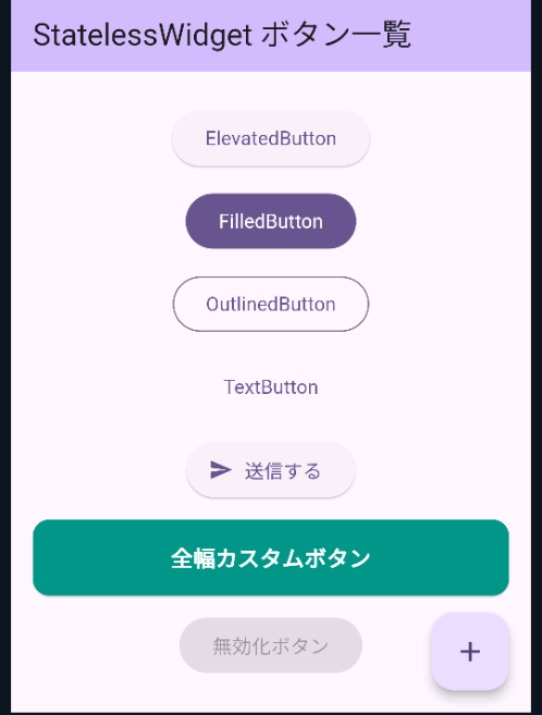
①ElevatedButton(エレベーテッド ボタン)
立体的にして目立たせるために使うボタンです。「保存」や「送信」といった際に使用します。マテリアルデザインのUIを取り入れたボタンです。フラットなレイアウトに視覚的な階層を追加したい場合に適しています。
サンプルでは、
onPressed:_showSnackBarで下部にボタンを押した時の表示をしています。 端的に言えば、ボタンタップ時のコールバック関数を定義しています。child: ボタン内に表示するウィジェット(文字)を指定しています。
をしています。そのほかにstyle プロパティで ElevatedButton.styleFrom() を使い、backgroundColor を指定して背景色を変えられます。

②FilledButton(フィルド ボタン)
塗りつぶして目立たせるボタンです。「重要なアクション(プライマリアクション)(決済や登録など)」をユーザーに行わせたい時に使用します。原則として一画面に一つまで使用します。
onPressed:_showSnackBarで下部にボタンを押した時の表示をしています。 端的に言えば、ボタンタップ時のコールバック関数を定義しています。- child: ボタン内に表示するウィジェット(文字)を指定しています。
をしています。そのほかにstyle プロパティに FilledButton.styleFrom() を渡して backgroundColor を指定して背景色を変えられます。

③OutlinedButton(アウトラインド・ボタン)
ボタンの周りに境界線がついたもので目立たせています。境界線のみで背景が透明なボタンは、画面内で「2番目に重要な操作(セカンダリアクション)」を行わせたい時に使用します。
FilledButton や ElevatedButton よりも主張が控えめなため、メインの操作(プライマリアクション)を引き立てる対になる操作として配置するのが基本です。
onPressed:_showSnackBarで下部にボタンを押した時の表示をしています。 端的に言えば、ボタンタップ時のコールバック関数を定義しています。- child: ボタン内に表示するウィジェット(文字)を指定しています。

④TextButton(テキスト ボタン)
あまり優先度の高くないボタンに使用します。背景色や境界線もなく画面内で「最も主張を抑えたい操作(サードアライ・控えめなアクション)」自然に溶け込ませたい場合に使用します。
onPressed:_showSnackBarで下部にボタンを押した時の表示をしています。 端的に言えば、ボタンタップ時のコールバック関数を定義- child: ボタン内に表示するウィジェット(文字)を指定しています。

⑤ElevatedButton.icon(エレベーテッド ボタン アイコン付き)
ボタンに立体感を持たせ、アイコンやテキストを表示させたい場合に使用します。アイコンはある程度importされているのでIcons.sendやIcons.shareなどでアイコンを左端に表示させつつテキストメッセージも表示します。その他のマテリアルデザインには下記のようなアイコンコンストラクタがあります。
| ボタン名 | 影の有無 / 背景 | 使うべき場面(アイコン付き) |
|---|---|---|
| FilledButton.icon | 影なし / 色塗り | 画面最優先の1つだけのアクション(例: 「+ 新規作成」) |
| ElevatedButton.icon | 影あり / 色塗り | 背景から浮き立たせたいメイン〜サブの重要アクション |
| OutlinedButton.icon | 影なし / 枠線のみ | 次点のアクション(例: 「🔍 条件で検索」「📂 ファイルを選択」) |
| TextButton.icon | 影なし / 背景なし | 控えめなアクション・リンク(例: 「🔗 詳しく見る」「ℹ️ ヘルプ」) |
onPressed:_showSnackBarで下部にボタンを押した時の表示をしています。 端的に言えば、ボタンタップ時のコールバック関数を定義しています。- child: ボタン内に表示するウィジェット(文字)を指定しています。
⑥SizedBox(サイズボックス ボタン)
レイアウトで指定した幅のコンテンツを作りたい場合に使用します。背景色や角丸などが不要で、単に「サイズ指定」や「余白づくり」をしたいだけなら SizedBox を使います。
| ウィジェット | 主な用途・特徴 | 軽量さ |
|---|---|---|
| SizedBox | サイズ固定・隙間の作成のみ。 余計な機能がないため動作が非常に軽量。const 指定が可能。 | 最軽量 |
| Container | 背景色・枠線・角丸・パディング・影など、複雑な装飾を施したい時。 | 普通 |
- onPressed:_showSnackBarで下部にボタンを押した時の表示をしています。 端的に言えば、ボタンタップ時のコールバック関数を定義しています。
- child: ボタン内に表示するウィジェット(文字)を指定しています。

⑦ElevatedButton(エレベーテッド ボタン 無効化)
onPressed:nullにすることによりそのボタンを「無効化(Disabled / 非活性)」にすることができます。- child: ボタン内に表示するウィジェット(文字)を指定しています。